x<-seq(-4,4,by=0.1)
y<-dnorm(x)
y1<-dt(x,1)
y2<-dt(x,4)
y3<-dt(x,50)Quarto Lab
Quarto
Quarto enables you to weave together content and executable code into a finished document. To learn more about Quarto see https://quarto.org.
Compare the Normal distribution to the Student-T Distribution
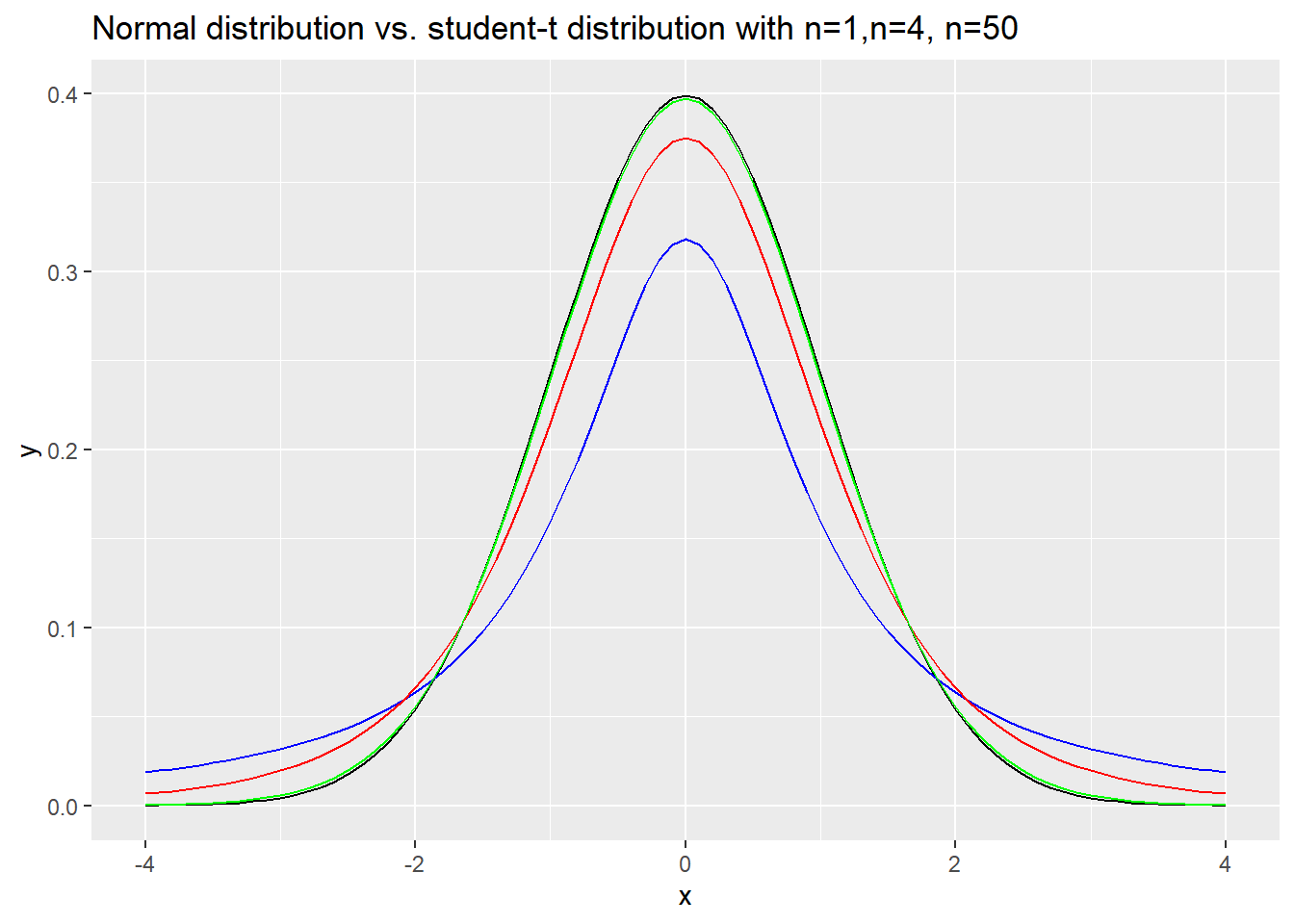
We’re going to create some distribution graphs and plot them. Here, we want to compare the normal distribution to the Student-T distribution (with different degrees of freedom). We are going to create a sequence of z (or t) values to measure the height of the distribution, and then use those values to draw the curve. We use the d-version of the distribution to measure the height of the pdf. Here, we are using 1, 4 and 50 degrees of freedom for the T-distribution curves.
Then we can plot the curves on the same graph to see how the shapes compare.
plot(x,y,type='l', main=" Standard Normal Distribution compared to \n Student-T for n=1 (blue),4 (red),50 (green)")
lines(x,y1,col="blue")
lines(x,y2,col="red")
lines(x,y3,col="green")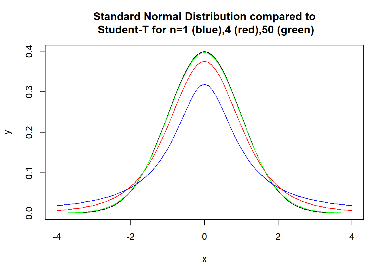
We can also plot the curves with ggplot, but that takes some reformatting. We need to take our separate vectors and make them into a dataframe. By default, the column names will be the names of the original vectors.
library(ggplot2)
datadist<-as.data.frame(cbind(x,y,y1,y2,y3))
ggplot(data=datadist,aes(x=x))+geom_line(aes(y=y))+geom_line(aes(y=y1),color="blue")+
  geom_line(aes(y=y2),col='red')+geom_line(aes(y=y3),color='green')+
  labs(title="Normal distribution vs. student-t distribution with n=1,n=4, n=50")